<?xml version="1.0" encoding="utf-8"?><feed xmlns="http://www.w3.org/2005/Atom" ><generator uri="https://jekyllrb.com/" version="3.10.0">Jekyll</generator><link href="https://www.henrybourne.uk/feed.xml" rel="self" type="application/atom+xml" /><link href="https://www.henrybourne.uk/" rel="alternate" type="text/html" /><updated>2026-01-08T03:54:15+00:00</updated><id>https://www.henrybourne.uk/feed.xml</id><title type="html">Henry Bourne</title><subtitle>Portfolio for Henry Bourne, Product Designer.</subtitle><entry><title type="html">What’s the Frequency 2.0</title><link href="https://www.henrybourne.uk/2020/04/19/whats-the-frequency-2-0.html" rel="alternate" type="text/html" title="What’s the Frequency 2.0" /><published>2020-04-19T20:56:45+00:00</published><updated>2020-04-19T20:56:45+00:00</updated><id>https://www.henrybourne.uk/2020/04/19/whats-the-frequency-2-0</id><content type="html" xml:base="https://www.henrybourne.uk/2020/04/19/whats-the-frequency-2-0.html"><![CDATA[<p>On the 21st February 2014, I released the first version of <strong>What’s the Frequency?</strong> on the iOS App Store.</p>

<p>This was quite an exciting time for me—it was the first app I’d ever developed entirely on my own. I’d had lots of experience designing and managing hardware and software products, delivered by teams of incredibly talented engineers, but this was the first time I’d actually written an app like this myself, from scratch.</p>

<h2 id="version-10">Version 1.0</h2>

<p><strong>What’s the Frequency?</strong> 1.0 was a very simple app in both concept and execution.</p>

<p>The concept is that the app plays a short tone or burst of filtered pink noise and you are challenged to identify the frequency of the tone, or the centre frequency of the filtered noise.</p>

<p>You never lost at the game. You had unlimited attempts to guess the correct frequency but every incorrect attempt resulted in lower accuracy for that game. You could keep going forever, but as soon as you made one incorrect guess, your accuracy would permanently drop below 100% and there would be little motivation to continue with that game. I hated seeing my accuracy drop below 100% so I would start a new game each time I guessed incorrectly. This experience felt broken.</p>

<p>
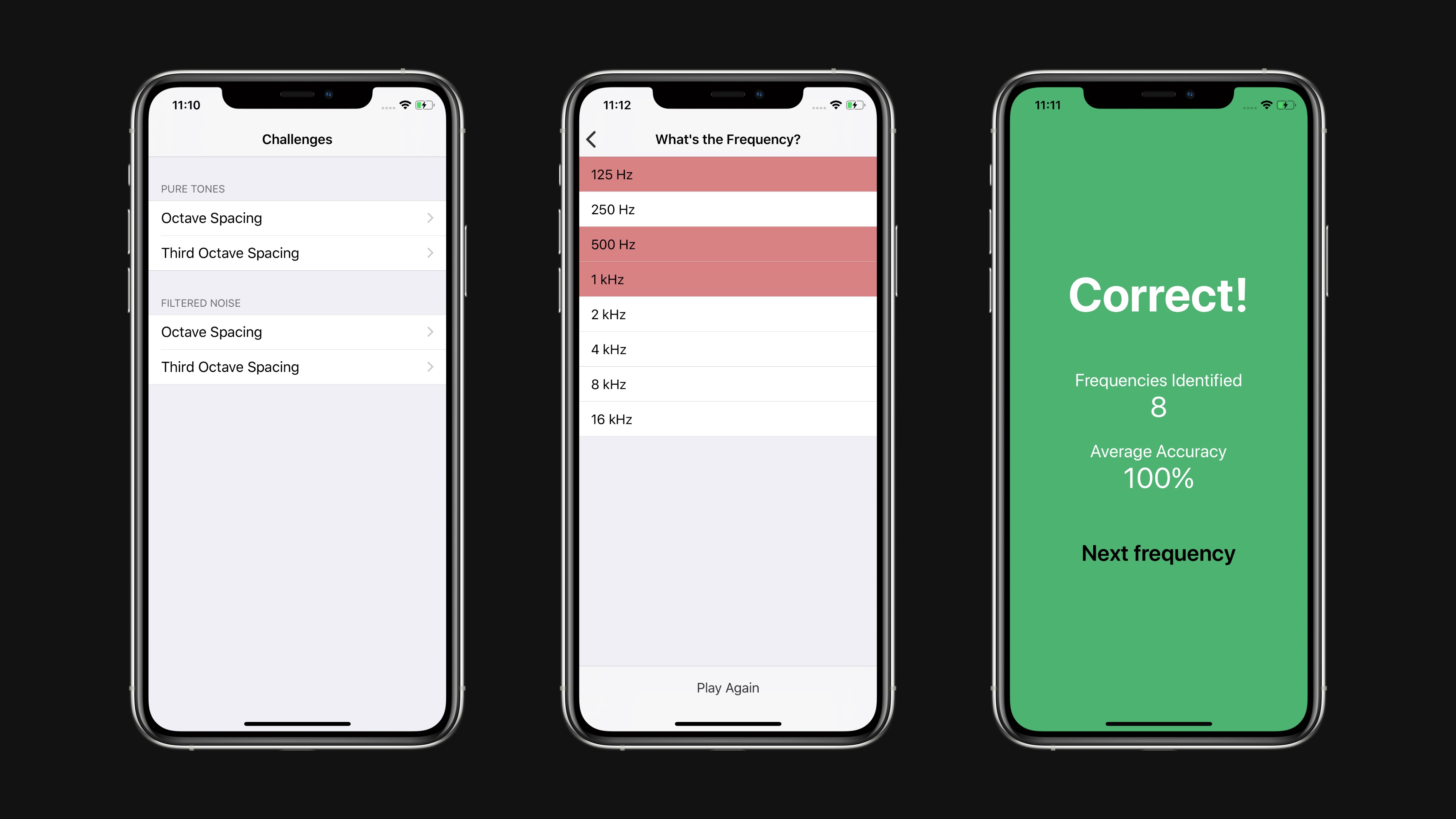
In execution, the app was entirely based on stock iOS views. The main menu was a UITableView that presented the various game options. Tapping one of these would present another UITableView containing a list of all the possible frequencies. You could tap on rows until you got the correct frequency, at which point a modal view would appear, telling you how well your were doing so far. Dismissing this would start the next round and play the next frequency to guess.</p>

<p>It was functional, but rather uninspiring.</p>

<div class="post-image"><img src="/assets/images/writing/whats-the-frequency-2-0/v1.jpg" /></div>

<p>The main motivation for creating this app, and the most interesting part to me at the time, was to see if I could write the generators and filters myself. I wanted to understand how to write to iOS audio buffers directly. The audio generation and processing code was relatively simple, but trying to find up to date documentation and references for Audio Units was difficult. It also involved a mix of Objective-C and C++ code which was another interesting challenge. It all worked fine and I certainly learned a lot, but I was never completely happy with the sound of the filters, or the experience of trying to work with those frameworks.</p>

<p>I had lots of ideas for how the app could be improved and where it could go, but given the combination of kids, other projects, and work commitments, I never gave it priority.</p>

<p>If your’e interested, the code for version 1.0 is available in a public GitHub repo <a href="https://github.com/henrybourne/WhatsTheFrequency">https://github.com/henrybourne/WhatsTheFrequency</a>.</p>

<h2 id="version-20">Version 2.0</h2>

<p>Sometime in 2018, I became motivated by a few different goals:</p>

<ul>
  <li>I was inspired by delightful animations I’d seen in some apps and wanted to learn how to make my own custom animations in an iOS app</li>
  <li>I wanted to improve the overall game experience, and make have more of a purpose</li>
  <li>I wanted to learn how to use Auto Layout, and properly support different device sizes</li>
  <li>I wanted to explore an audio engine I’d come across—AudioKit</li>
  <li>I wanted more experience writing Swift</li>
</ul>

<p>So, I started work on version <strong>What’s the Frequency?</strong> 2.0.</p>

<h2 id="cleaner-and-more-customised-ui">Cleaner and More Customised UI</h2>

<p>
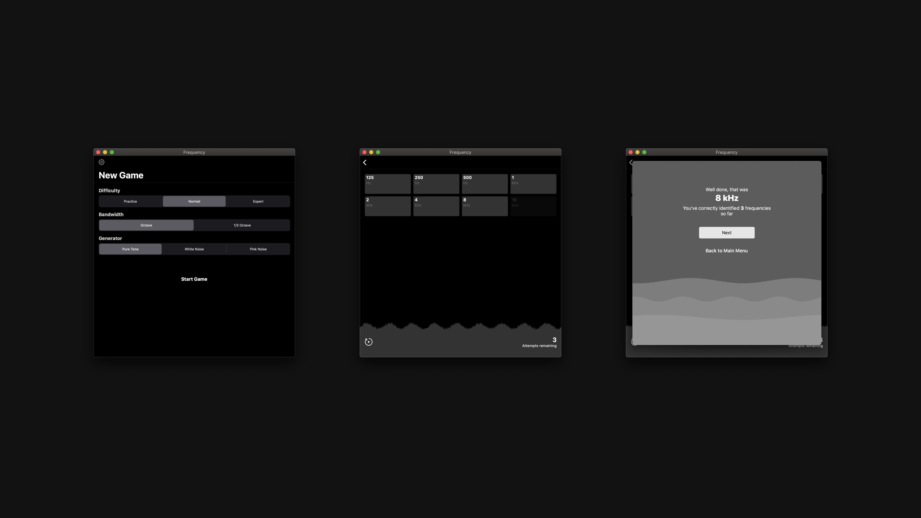
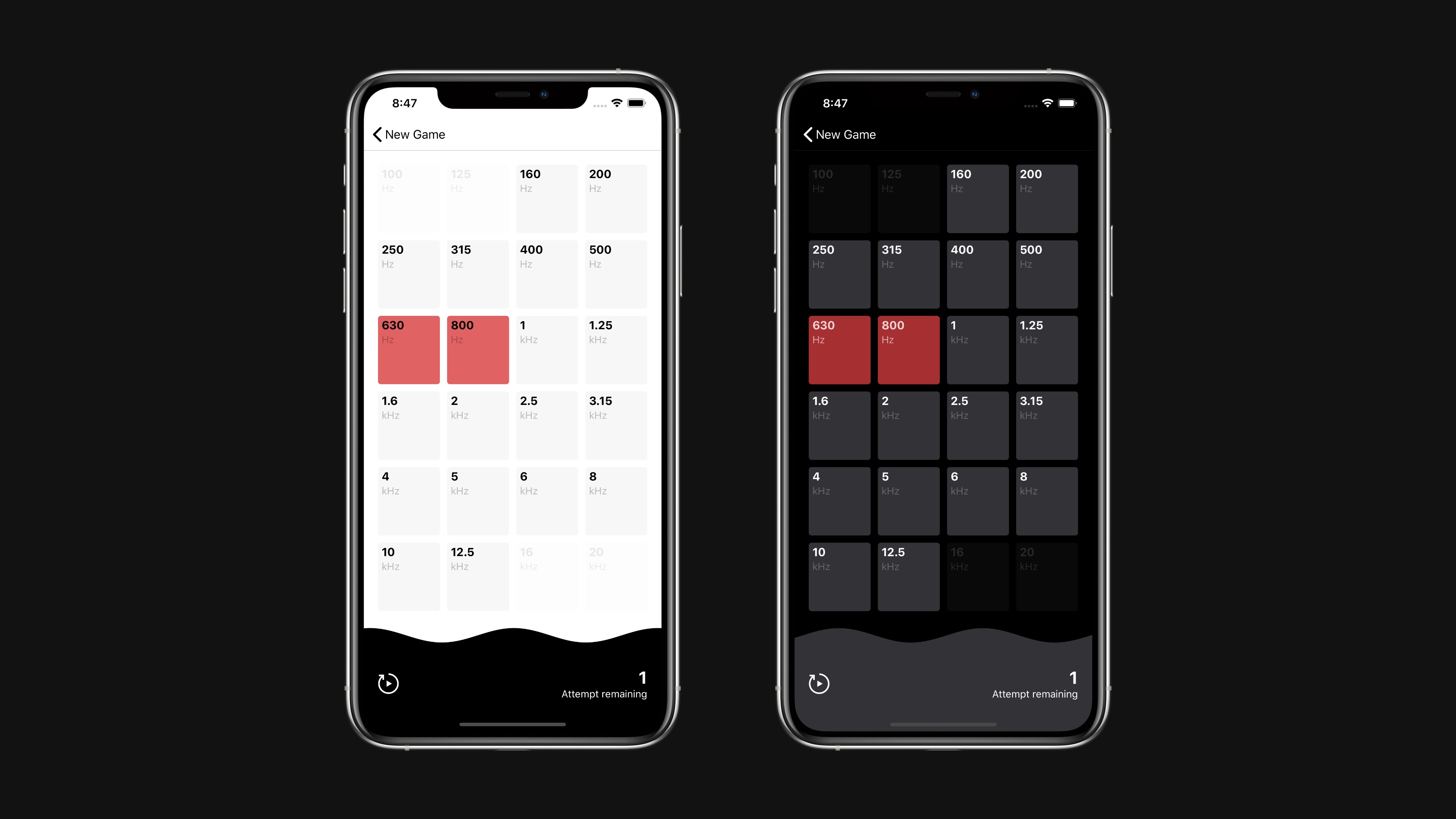
Rather than rely completely on stock iOS UI components, I wanted to create a more purpose-built interface for the main game view. So gone is the standard UITableView—replaced by a grid of buttons that allow all possible frequencies to be visible on screen at once. I think it’s a nicer presentation, and one that gives the app much more of its own character.</p>

<p>It also features support for light and dark modes, following the system state of your device.</p>

<div class="post-image"><img src="/assets/images/writing/whats-the-frequency-2-0/v2.jpg" /></div>

<p>As part of the custom UI, I wanted to include some animations to represent tones and noise. I decided to show a wave along the bottom of the game view that animates as the audio plays. This can also offer some visual hinting to help identify frequencies which can be useful as you’re starting out.</p>

<p>When you win or lose a round, there are animated waves in the background of the dialogs. These move quickly in the ‘win’ view, and slowly in the ‘lose’ view which help to give the app a little more emotion.</p>

<p>I’m sure these animations could be optimised, which will be one of the next updates. To help with this I might make the code open source and ask for contributions from my more experienced developer friends.</p>

<div class="post-image"><img src="/assets/images/writing/whats-the-frequency-2-0/v2-wavy-lines.jpg" /></div>

<h2 id="game-experience">Game Experience</h2>

<p>
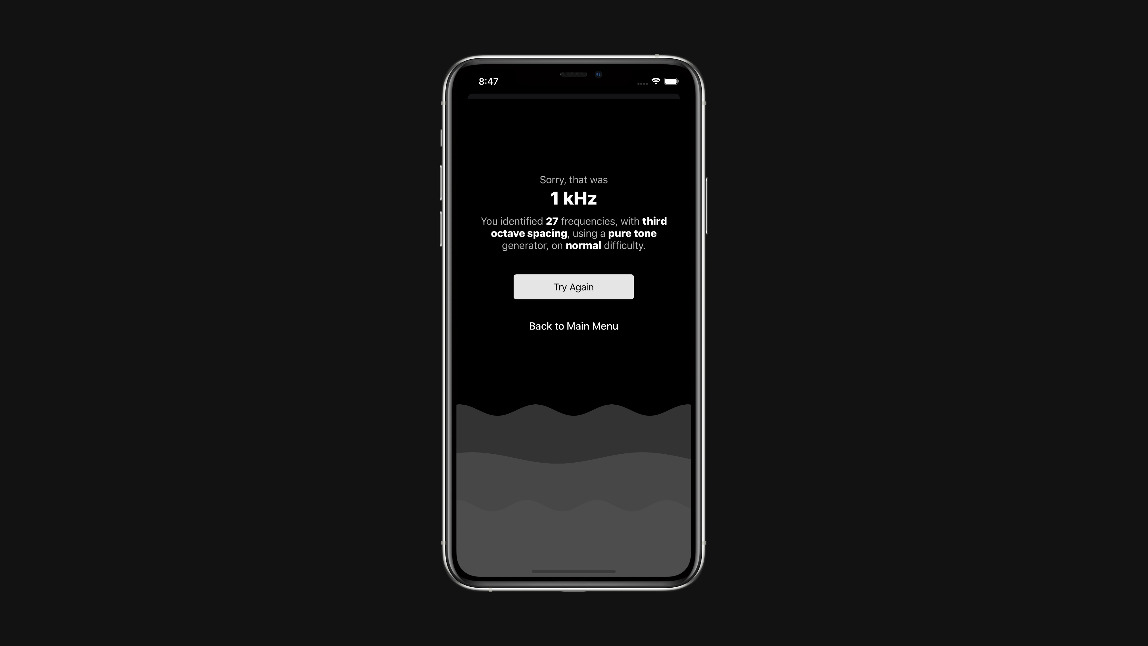
Version 2.0 changes the game to give it a clearer purpose. There are three difficulty modes—Practice, Normal, and Difficult.</p>

<p>In Normal difficulty, you have three chances to guess each frequency. If you guess incorrectly three times you lose the round and the game ends. The goal is to identify as many frequencies as possible.</p>

<p>In Difficult difficulty, you only have a single chance to identify each frequency, meaning you have to be much more skilled to play a long game.</p>

<p>In Practice mode, you have unlimited guesses allowing you spend time honing your identification skills.</p>

<p>When the game ends you see a clear summary of your game, giving you a clear goal for you to try to beat next time.</p>

<p>Version 2.0 also adds the ability to disable certain frequencies, removing them from the game. This can be useful if you’re using a device which is limited in low frequency reproduction, or if you’re struggling to identify very high frequencies.</p>

<p>I think these changes create a much better structure and improve the overall experience.</p>

<h2 id="audio-engine">Audio Engine</h2>

<p>AudioKit powers all generation and processing. It’s a fantastic framework that’s incredibly easy to use. For the pure tones, I create an oscillator, send it through an envelope filter to handle fading in and out, then connect it to the output. That’s it. It’s only one extra step for the noise, which uses a white or pink noise generator, a bandpass filter, then the envelope filter. There was a bit more to it than that, particularly around dealing with the audio lifecycle and changing between sounds without clicks or noticeable glides, but overall it was a really simple and great experience. Congratulations to the AudioKit team for creating such a great tool and allowing me to spend more time concentrating on the custom UI and animations.</p>

<h2 id="support-for-all-device-sizes">Support for all Device Sizes</h2>

<p>Version 2.0 properly supports all current Apple device and layout sizes. Using Auto Layout for the views made this very simple, and also enabled iPad support. So whether you’re running the app on an iPhone SE, an iPhone 11 Pro Max, or an iPad in fullscreen, split view, or in popover, the app will look great and work well.</p>

<h2 id="in-future">In Future</h2>

<p>There are lots of tweaks and improvements I’d like to make in future. Hopefully I’ll get round to them in less time than it took to release version 2.0…</p>

<p>Thanks to Apple’s Mac Catalyst project, I was able to get the app running on a Mac in a few minutes. It was literally a case of checking a box that says ‘Mac’. Fantastic work to the team at Apple for making it so easy.</p>

<p>Unfortunately I don’t think AudioKit’s support for XCFramework is ready for production yet, so I can’t yet create a single app with Mac Catalyst support. I can create separate build that works on a Mac, but I’m not sure if I can submit this as a separate app… I’m not sure in the submission process. If you know more about this and know how I can get a Mac Catalyst app on the store now, please let me know.</p>

<div class="post-image"><img src="/assets/images/writing/whats-the-frequency-2-0/v2-catalyst.jpg" /></div>]]></content><author><name></name></author><summary type="html"><![CDATA[On the 21st February 2014, I released the first version of What’s the Frequency? on the iOS App Store.]]></summary></entry><entry><title type="html">Future Directions in Intelligent Sound Engineering</title><link href="https://www.henrybourne.uk/2016/11/28/future-directions-in-intelligent-sound-engineering.html" rel="alternate" type="text/html" title="Future Directions in Intelligent Sound Engineering" /><published>2016-11-28T20:56:45+00:00</published><updated>2016-11-28T20:56:45+00:00</updated><id>https://www.henrybourne.uk/2016/11/28/future-directions-in-intelligent-sound-engineering</id><content type="html" xml:base="https://www.henrybourne.uk/2016/11/28/future-directions-in-intelligent-sound-engineering.html"><![CDATA[<p>Back in September I was part of a panel discussion on future directions in Intelligent Sound Engineering. This was part of the 2nd AES Workshop on Intelligent Music Production, at the Centre for Digital Music at Queen Mary University of London.</p>

<p>Despite the shaky start (macOS hot corners!) it was an interesting and entertaining event. Thanks to all involved for hosting the event and inviting me to participate.</p>

<div class="post-video"><iframe src="https://www.youtube-nocookie.com/embed/4WHWdh5U9iA" frameborder="0" allow="accelerometer; autoplay; clipboard-write; encrypted-media; gyroscope; picture-in-picture" allowfullscreen=""></iframe></div>]]></content><author><name></name></author><summary type="html"><![CDATA[Back in September I was part of a panel discussion on future directions in Intelligent Sound Engineering. This was part of the 2nd AES Workshop on Intelligent Music Production, at the Centre for Digital Music at Queen Mary University of London.]]></summary></entry><entry><title type="html">Snacking</title><link href="https://www.henrybourne.uk/2016/08/24/snacking.html" rel="alternate" type="text/html" title="Snacking" /><published>2016-08-24T20:56:45+00:00</published><updated>2016-08-24T20:56:45+00:00</updated><id>https://www.henrybourne.uk/2016/08/24/snacking</id><content type="html" xml:base="https://www.henrybourne.uk/2016/08/24/snacking.html"><![CDATA[<div class="post-image"><img src="/assets/images/writing/snacking/snacking.jpeg" /></div>

<p>I came across a really interesting discussion on the importance of prioritisation from a recent episode of the Intercom podcast. There was a great use of the term ‘snacking’ to describe the potentially undesirable attraction to low effort, low impact tasks. There’s a summary here: <a href="https://blog.intercom.io/first-rule-prioritization-no-snacking">https://blog.intercom.io/first-rule-prioritization-no-snacking</a></p>

<blockquote>
  <p>This work is easy to justify because “it only took 30 minutes”. And when it achieves nothing useful, it’s easy to excuse because it “took us so little time”. This is not strategy – this is flapping. Do this enough times and you’ll grow a low impact team that doesn’t achieve anything.</p>

  <p>The default position for a smart team without a clear plan is to snack.</p>
</blockquote>

<p>This is great advice. It’s very easy to be tempted into doing work because it seems easy, or because it’s quick. I often hear phrases like “We should put this in because it will only take a few hours”, or “he’s working in this area, so we might as well do this at the same time”. I’ve certainly made statements like this in the past, and I’ll probably making them again soon – hopefully recognising them for what they are at the time. These phrases usually align with work that is of personal interest to the person speaking, addressing particular personal annoyances that they want fixing regardless of their impact. It’s fine to act on these statements, as long as you understand and accept the impact for your customers and your business.</p>

<p>Remember that for every hour that you or someone in your team spends snacking on low effort, low impact work, you’re adding an extra hour onto the release of your more important, higher impact work.</p>

<p>There is a counter arguement in which you’ll hear people mention phrases like “death by a thousand cuts”. The arguement is that by spending a day fixing fifty tiny (and low impact) user annoyances, you will add value to your product and make your users happier by fixing the most common small complaints. This is a reasonable arguement, as long as you, your team, and your company, all agree that this is the most effective and productive way to spend your time on that day and you accept the delay to the work that you’re not doing instead.</p>

<p>If not, stop snacking and keep your focus on the goal of high impact work.</p>

<blockquote>
  <p>As an individual atomic unit, any one of those changes is valuable, right? It’s not that the reward isn’t there. They each have a positive benefit, but they’re all small, local optimizations. They all avoid the big bet you should be making, the more complex question you should be asking yourself, such as are we growing more relevant or less relevant as a product for our users? Is the world around us changing and do we need to be aggressive in changing with it or leading our users to a new reality? A little snack here and there never hurt anybody, but trying to do nothing but eat potato chips all day will eventually leave you dead.</p>
</blockquote>]]></content><author><name></name></author><summary type="html"><![CDATA[]]></summary></entry><entry><title type="html">Less Is Not Always More</title><link href="https://www.henrybourne.uk/2016/02/24/less-is-not-always-more.html" rel="alternate" type="text/html" title="Less Is Not Always More" /><published>2016-02-24T20:56:45+00:00</published><updated>2016-02-24T20:56:45+00:00</updated><id>https://www.henrybourne.uk/2016/02/24/less-is-not-always-more</id><content type="html" xml:base="https://www.henrybourne.uk/2016/02/24/less-is-not-always-more.html"><![CDATA[<p>A few years ago, I was discussing a new product feature with a colleague. What they said in that conversation had me momentarily stunned. I didn’t know how to respond.</p>

<p>We were discussing a new design and debating whether or not to include a certain button. I wanted to add it and they didn’t. After hearing many protests about how adding this button would increase the complexity of the interface, I decided to try to understand their motivations. I asked a direct question: “do you really think that the fewer buttons a product has, the simpler it is?” Their response was an emphatic “yes”.</p>

<p>I didn’t know how to respond—I was disappointed. When first asked the question, I think many people may side with my colleague. I’d like to explain why I thought they were wrong, and why I felt so uncomfortable.</p>

<p>An interface can be difficult to use if it has too few controls. When there are not enough controls, each control must take responsibility for multiple functions.</p>

<p>Imagine a simple product that opens and closes a garage door. One version of this product’s control interface provides three buttons - open, close, and stop. Another version has one button. Which do you think is simpler for people to understand and use?</p>

<p>The one-button interface makes the function of the button at any time ambiguous. Consider the case when the door is closed. Presumably if I press the button the door will open. But what happens if I press the button while the door is opening? Maybe the door will stop. Now, what happens when I press the button again? Does the door continue opening, or does it start to close? What if when I press the button while the door is moving, it doesn’t stop, but instead starts moving in the other direction? Unless you memorise what the button does in each state, the intended function is not clear or obvious. The functionality of the product is so simple, yet by overloading one button it becomes unnecessarily complicated.</p>

<p>The three-button interface, however, is remarkable in its simplicity. Press open and the door will open. Press stop and a moving door will stop. Press close and the door will close. It’s got more buttons, but it’s much clearer.</p>

<p>I want to be clear that I’m not supporting the opposite position – I don’t think that the more buttons an interface has, the easier it is to use. I don’t think you should make statements like “it has fewer buttons, so it’s simpler” or “it has more buttons, so it’s simpler”. These cases are rarely binary. Every situation needs appropriate thought and a considered response.</p>

<p>As a different example, think about the iPhone. This seems to be used often as an example of the pinnacle of simplicity: “it’s only got one button – one Button! It’s so simple.” Despite the fact that the phone actually has more than one physical control (home button, power button, volume buttons, and possibly a mute/lock switch), it’s a pretty useless device if that is the extent of the controls to which you have access. As soon as you turn the device on, the screen fills with many rich and varied controls, all hopefully designed with an appropriate form and layout to make their function clear.</p>

<p>To me, the beauty and simplicity of devices like the iPhone, is that its interface adapts appropriately to the many and varied functions that it is asked to provide. If the iPhone did only have a single button, and that button somehow had to control every function the iPhone could provide, it would be far from a simple device.</p>

<p>If you calculate complexity based on the number of buttons, or any type of control, that an interface has, you might consider the iPhone to be the most complicated device in existence. Many people find it to be the opposite.</p>]]></content><author><name></name></author><summary type="html"><![CDATA[A few years ago, I was discussing a new product feature with a colleague. What they said in that conversation had me momentarily stunned. I didn’t know how to respond.]]></summary></entry><entry><title type="html">It’s All About the Details</title><link href="https://www.henrybourne.uk/2015/02/12/its-all-about-the-details.html" rel="alternate" type="text/html" title="It’s All About the Details" /><published>2015-02-12T20:56:45+00:00</published><updated>2015-02-12T20:56:45+00:00</updated><id>https://www.henrybourne.uk/2015/02/12/its-all-about-the-details</id><content type="html" xml:base="https://www.henrybourne.uk/2015/02/12/its-all-about-the-details.html"><![CDATA[<p>From Tobias Frere-Jones’ <a href="http://www.frerejones.com/blog/typeface-mechanics-001/">new series on typeface mechanics</a>:</p>

<blockquote>
  <p>Square shapes like H have a simple and stable relationship to the baseline and cap height. Their upper and lower edges coincide with these boundaries and stay put. But only a narrow sliver of an O is the full height, and the rest of the shape falls away. The parts that are too short greatly outnumber the parts that are big enough, so we conclude — wrongly, but very reliably — that the round shape is too small.</p>

  <p>If the “correct” height appears inadequate, “too much” will look right. So the O is made taller and deeper than the H, even if the most stringent mathematical reasoning would declare it incorrect. But we read with our eyes, not with rulers, so the eye should win every time.</p>
</blockquote>

<p>It’s details like this that make good products. Details that you’d never notice on their own, but ones that all add up to create a refined and effortless result. Without them, you get mediocrity. Good enough. Functionality that doesn’t quite feel right.</p>

<p>These are the kind of details I spend a lot of my working days considering. Some people consider it overthinking. To me, it’s an essential part of the process. If you think a detail doesn’t matter, you’re not doing justice to your product and you’re letting your customers down. Charles Eames put it very directly:</p>

<blockquote>
  <p>The details are not the details. They make the design.</p>
</blockquote>

<p>I can’t wait to read the rest of this series.</p>]]></content><author><name></name></author><summary type="html"><![CDATA[From Tobias Frere-Jones’ new series on typeface mechanics:]]></summary></entry><entry><title type="html">Beats</title><link href="https://www.henrybourne.uk/2014/06/11/beats.html" rel="alternate" type="text/html" title="Beats" /><published>2014-06-11T20:56:45+00:00</published><updated>2014-06-11T20:56:45+00:00</updated><id>https://www.henrybourne.uk/2014/06/11/beats</id><content type="html" xml:base="https://www.henrybourne.uk/2014/06/11/beats.html"><![CDATA[<p>Apple recently bought Beats. You might have heard about that.</p>

<p>Before the acquisition, I heard from a lot of friends, colleagues, and general folk on the internet, that Beats headphones sound dreadful - that they sound so bass heavy and make everything sound ‘muddy’. These views got heavily amplified after the acquisition.</p>

<p>The Beats brand has become something of a fashion statement, much like when the iPod was released with its white earbud cables. I don’t doubt that a lot of people bought Beats because of this, but I’d bet that there are a lot of people who bought them because they liked the sound.</p>

<p>I saw some in a store recently and thought it was about time I had a listen for myself.</p>

<p>I walked into the store, lifted up the headphones - the Beats Studio model, I think - and engulfed myself in a flood of extremely low frequencies. A lot of low end. As John Gruber put it in a recent episode of <a href="http://daringfireball.net/thetalkshow/">The Talk Show</a>, they sound “like a nightclub - in your head”. You know what? With the right style of music, they sound exactly like that. It seems that the head-club experience is exactly what Beats’ target market want. They want you to feel as if you’re watching the artists live, as if you’re at a venue.</p>

<blockquote>
  <p>The Beats Acoustic Engine™ makes your listening experience intimate, personal, and real. Our signature DSP software is designed to generate the emotional experience that Dr. Dre, Jimmy Iovine, and some of the music industry’s greatest rock, hip-hop, pop, electronic, and R&amp;B producers want you to feel. This is how music would sound if the artist could play it back for you in person.</p>
</blockquote>

<p>The designers deserve a lot of credit for creating a product that achieves that goal. It really does sound like that - with the right style of music. You shouldn’t expect to play Jimi Hendrix through these headphones and have an appropriate reproduction of his music. If you do expect that and are subsequently disappointed, you’ve misunderstood the product. I have Sennheiser HD25 headphones. I think they are absolutely wonderful and excel in many areas, but they didn’t create an experience anywhere close to the intended Beats experience.</p>

<p>Every product has a purpose. If you don’t like it, don’t understand it, or don’t need it, then don’t buy it. You have a choice and there are always other options. Sunglasses are not ideal indoors. Normal glasses are not ideal in bright sun. You shouldn’t expect headphones designed for one application to work well for another.</p>]]></content><author><name></name></author><summary type="html"><![CDATA[Apple recently bought Beats. You might have heard about that.]]></summary></entry><entry><title type="html">Nothing is Something</title><link href="https://www.henrybourne.uk/2014/02/05/nothing-is-something.html" rel="alternate" type="text/html" title="Nothing is Something" /><published>2014-02-05T20:56:45+00:00</published><updated>2014-02-05T20:56:45+00:00</updated><id>https://www.henrybourne.uk/2014/02/05/nothing-is-something</id><content type="html" xml:base="https://www.henrybourne.uk/2014/02/05/nothing-is-something.html"><![CDATA[<p>I often find it difficult to get into a deep focus. I feel that I’m constantly aware of my surroundings. I notice what happens in the room around me. I notice when people enter or leave. I notice the changes in the tones of conversations in the room and I can pick up on the emotions in the different groups. When I try to sleep, my awareness of the sounds around me, my temperature, and most of all my thoughts, increases. There are so many events around us competing for our attention and distracting our focus.</p>

<p>I’m a fairly frequent traveller. When I travel by aeroplane, I find it difficult to sleep. I’m nearing 200 cm tall (about 6”4’), so I don’t fit in the seats. The head supports are too low, hunching my shoulders forwards, and my knees have to slot into the gaps between the seats in front. Thankfully, I’ve yet to sit next to a fellow long-shank and fight for those precious knee gaps. With all these distractions and constraints, it’s no surprise that I can’t sleep.</p>

<p>I have managed to sleep on flights on two occasions. Both have been due to the very rare business class upgrade on long flights from the UK to Japan, China, or Australia. I can mute the surroundings with earplugs and an eye mask. Most importantly, I can completely stretch out. I have space.</p>

<p>If you can create visual, auditory, and physical space in which you can focus on a task and become isolated from all the external distractions, it is easy to imagine the increase in productivity. The Four Seasons were right; Silence is Golden. There is something in nothing.</p>

<p>The same principles apply to the design of the products, interfaces and workflows we use every day.</p>

<p>In visual design, whitespace is a great example. It’s tempting to think that all available space must be used to present information and that unused space is wasted or costly. Intentionally leaving space can actually afford clarity and give design elements room to breathe. You can reduce the effort required by the user to understand and navigate the content. It certainly can give you something for nothing.</p>

<p>In his book ‘The Laws of Simplicity’, John Maeda recalls a visit to the house of his friend. They ate sushi from white plates on a white table on a room where all the walls, floors and furniture were also white. The lack of colour or inspiration from the other elements in the room let the colours in the sushi appear much more vivid and interesting than usual and made the taste much more intense and detailed. He suggests this is due to the lack of any other colours, shapes or details competing for his attention. Again, getting something from nothing.</p>

<p>I originally chose a style for this site that used large images and a parallax scrolling effect. It looked impressive but it was slow to load and the useful content felt secondary. This is a place for me to express my thoughts and for people to get to know me. The goal is clear communication. What you see now is a result of stripping away all clutter and unnecessary decoration. It makes better use of whitespace and has clearer typography allowing my thoughts to be easily consumed. There are no images or colours as part of the site’s structure but I may use images as tools for clearer expression in the content. Because I’ve removed all clutter and ornamentation, to use John Maeda’s metaphor, the content tastes better.</p>

<p>I recently bought iA Writer. I find it creates a very productive writing environment where anything that is not essential to the process of writing is removed. You are not tempted to alter styles or layout. There are no toolbars, buttons or other bits of chrome to subconsciously process. There is only your text rendered in a readable font. Regardless of the size of your display, the text doesn’t even extend to its left and right extents; it’s purposefully restricted to display a maximum of 65 characters per line. That’s following rules of good typography and makes reading very natural. I think it’s a great example of intentionally leaving functionality out to create something more useful for its intended purpose.</p>

<p>It’s tempting to use all the colours, sizes, styles and space available to create something rich and vibrant. Great restraint is needed to avoid this. When in doubt, don’t add. Take away if possible. And realise that nothing can be a useful tool.</p>

<p>Nothing is indeed something.</p>]]></content><author><name></name></author><summary type="html"><![CDATA[I often find it difficult to get into a deep focus. I feel that I’m constantly aware of my surroundings. I notice what happens in the room around me. I notice when people enter or leave. I notice the changes in the tones of conversations in the room and I can pick up on the emotions in the different groups. When I try to sleep, my awareness of the sounds around me, my temperature, and most of all my thoughts, increases. There are so many events around us competing for our attention and distracting our focus.]]></summary></entry><entry><title type="html">Ship Early then Iterate</title><link href="https://www.henrybourne.uk/2014/01/25/ship-early-then-iterate.html" rel="alternate" type="text/html" title="Ship Early then Iterate" /><published>2014-01-25T20:56:45+00:00</published><updated>2014-01-25T20:56:45+00:00</updated><id>https://www.henrybourne.uk/2014/01/25/ship-early-then-iterate</id><content type="html" xml:base="https://www.henrybourne.uk/2014/01/25/ship-early-then-iterate.html"><![CDATA[<p>Read this article on 99u: <a href="http://99u.com/articles/21757/satisficing-how-overachievers-stay-sane-and-avoid-burn-out">http://99u.com/articles/21757/satisficing-how-overachievers-stay-sane-and-avoid-burn-out</a>. It contains so many inspirational points, one of which struck a particular chord with me tonight.</p>

<p>I’ve been working on a new iPhone app for a while. Motivated by the suggestion that one should ‘ship early, then iterate’, I’m going to release it soon in its current state. It doesn’t do everything I consider that it needs to yet, but it certainly provides its core functionality clearly and usefully.</p>

<p>‘Ship early, then iterate’ seems like a good philosophy for anyone who creates products, for a number of reasons; Firstly, working on the assumption that you get your core functionality implemented first, you can provide for the majority of users in the majority of use cases. Extra features, functionality or complexity that the minority require can come along later.</p>

<p>Secondly, it allows a product to get out into the hands of the users. There is no better source of feedback and testing of real use cases than directly from the users of your product. The users are the ones that should be considered when any decision about the product is made and their feedback should never be ignored. Having a simpler feature set and workflow allows the design to more easily adapt to any changes required. It’s much easier to correct a young a flexible platform than one that is mature and highly complex.</p>

<p>“To not do anything because it can’t be exactly how you imagined in your head on the first run will hinder you immensely.”
I’ll post up here when I get the app released. It’s probably of interest to the serious audio nerds amongst you.</p>]]></content><author><name></name></author><summary type="html"><![CDATA[Read this article on 99u: http://99u.com/articles/21757/satisficing-how-overachievers-stay-sane-and-avoid-burn-out. It contains so many inspirational points, one of which struck a particular chord with me tonight.]]></summary></entry><entry><title type="html">Ship Early then Iterate</title><link href="https://www.henrybourne.uk/2013/10/31/scroll-down.html" rel="alternate" type="text/html" title="Ship Early then Iterate" /><published>2013-10-31T20:56:45+00:00</published><updated>2013-10-31T20:56:45+00:00</updated><id>https://www.henrybourne.uk/2013/10/31/scroll-down</id><content type="html" xml:base="https://www.henrybourne.uk/2013/10/31/scroll-down.html"><![CDATA[<p>I had a thought inspired by the name of this post on qcdesigners: <a href="http://qcdesigners.com/index.php/forums/topic/79/scroll-up-vs-scroll-down">http://qcdesigners.com/index.php/forums/topic/79/scroll-up-vs-scroll-down</a></p>

<p>For a long long time, we have had scroll bars at the edges of content areas when the content overflows the visible area. To see text or an image that is cut off by the lower edge of the visible area, one would either grab the scroll bar and drag it down, or use a mouse wheel or trackpad and perform a downwards gesture. I think we’d all agree to call that action ‘scrolling down’.</p>

<p>A different interaction method, brought to the mainstream by touch screen devices, lets you touch the content directly and drag the way the content should move. To reveal text that is overflowing off the lower edge of the screen, you touch the content and drag your finger upwards.</p>

<p>What do you call this upwards gesture?</p>

<p>I would guess, that most people would still refer to it as ‘scrolling down’. Maybe that’s due to the fact that you are able to read content further down the page. Maybe it’s because of the ingrained action of grabbing scroll bars and moving them downwards.</p>

<p>But what if that history with scroll bars hadn’t existed… What if this ‘natural scrolling’ had always been the way? What might a newer generation of users consider this action as? One perception might be that you are actually moving the content upwards. Nothing is moving down. To a technically illiterate person, a very young child who can use a touch device for example, what is ‘scrolling’ anyway? They are just moving content around.</p>

<p>As touch becomes more prevalent, and scroll bars feature less and less in user interfaces, I wonder if it’s time to change how we refer to certain actions that may have a more intuitive description.</p>

<p>I find it fascinating going through these thought processes. I didn’t come to any real conclusion on this, but I find it great as a thought exercise to try to open up a response or action we just take as given. Just don’t get me started on people who still insist on using a floppy disk as a save icon….</p>]]></content><author><name></name></author><summary type="html"><![CDATA[I had a thought inspired by the name of this post on qcdesigners: http://qcdesigners.com/index.php/forums/topic/79/scroll-up-vs-scroll-down]]></summary></entry><entry><title type="html">Pressures of Product Design</title><link href="https://www.henrybourne.uk/2013/10/07/pressures-of-product-design.html" rel="alternate" type="text/html" title="Pressures of Product Design" /><published>2013-10-07T20:56:45+00:00</published><updated>2013-10-07T20:56:45+00:00</updated><id>https://www.henrybourne.uk/2013/10/07/pressures-of-product-design</id><content type="html" xml:base="https://www.henrybourne.uk/2013/10/07/pressures-of-product-design.html"><![CDATA[<p>Here’s a fantastic article, giving a rare insight into the process and pressures or creating a product. In this case, running up to the launch of the first iPhone. For those involved in designing, creating and launching products, a lot of this should ring true. For those who aren’t, it’s a great view into an aspect of a great product that you wouldn’t usually think about.</p>

<p><a href="http://www.nytimes.com/2013/10/06/magazine/and-then-steve-said-let-there-be-an-iphone.html">http://www.nytimes.com/2013/10/06/magazine/and-then-steve-said-let-there-be-an-iphone.html</a></p>]]></content><author><name></name></author><summary type="html"><![CDATA[Here’s a fantastic article, giving a rare insight into the process and pressures or creating a product. In this case, running up to the launch of the first iPhone. For those involved in designing, creating and launching products, a lot of this should ring true. For those who aren’t, it’s a great view into an aspect of a great product that you wouldn’t usually think about.]]></summary></entry></feed>